
Fine Art Photography and Colour
I love colour.
I have a childlike delight in primary colours – particularly the exaggerated colour of flowers – as well as a more adult passion for the physics, the visual perception, for colour wheels, colour theory and its history, the symbolism, the psychology, the interactions. In fact, I’m fascinated by each and every aspect of colour.
But photographically, I’m more cautious – colour cautious that is.
In the 70s, when I was first introduced to photography, colour had the reputation of being tricky. Whilst black and white film – its developing and printing – was within the sphere of an interested amateur with a darkroom at home, colour was considered to be well outside the amateur orbit – only for the professional photographer and commercial printers. And so it made sense for me to work solely in monochrome; it was a practical choice, as well as being emotionally in tune with the low-colour world of my childhood and with the draughtsmanship and drawings of my engineering world.
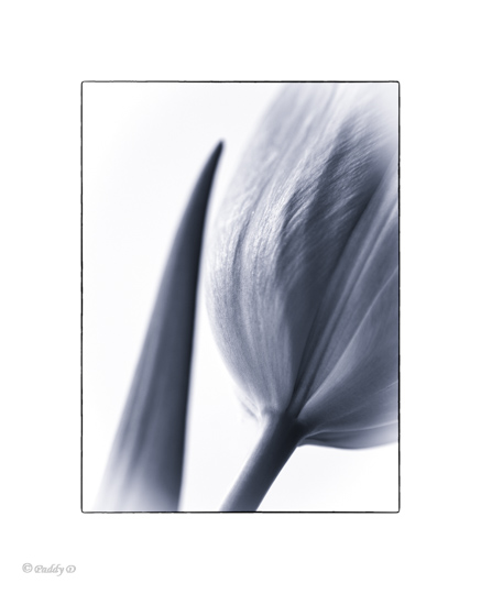
From 'Old Friends' Series
When I started to be interested in digital photography some 40 years later, the world was exuberantly colourful and technology had made huge advances, so I naturally assumed that colour photography would have lost its tricky reputation. But I didn’t find it as satisfying as I expected; the colours I saw in my images never quite matched up with the colours I saw in my mind’s eye, the colours I remembered from 'being there' with the camera.
Seeking to explain this anomoly, I started reading and learning more about the physics of colour and about colour theory, whilst assuming that Photoshop would provide a temporary solution – a work‑around which would help me feel more satisfied with the colours in my images. But the words ‘sledgehammer’ and ‘nut’ spring to mind. Photoshop gave me the option to change three different properties (the hue, the saturation and the luminosity) in each of eight colour channels (red, orange, yellow, green, aqua, blue, purple and magenta) as well as the overall colour temperature. Now it was easy for me to make the colours in an image look ridiculously wrong; that became far easier than getting them right. Colour photography wasn't just ‘tricky’ it felt ‘slippery’ too – unreliable, untrustworthy; my colour confidence plummeted, and I returned to my black and white roots.
Of course I justified this return to monochrome, talked about resuming old skills; about the technical incompatibility between digital and printed images; about respecting my photographic forebears; said that monochrome is a better learning-medium. And whilst all this is undoubtedly true, the real reason was that it allowed me to retreat inside my comfort zone; I was reducing the opportunity to make mistakes – eliminating error. Falling back on ‘good old black and white’ – reliable, dependable black and white. And, for a long time, it worked – I learnt a lot, progressed a lot, achieved a lot.
But …
… but then my comfort zone stopped being comfortable.
Increasingly it was a battle between ‘head’ and ‘heart’ because …
I love colour.
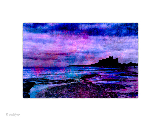
Bamburgh Castle, Northumberland
I’ve explained this in detail because, without the context, the enormity of me taking up with colour doesn’t seem at all enormous! And also because it's helped me distinguish the 'myths' of my decisions from the reality.
And so Fine Art photography means that I stop playing it safe; that I stop being an engineer, looking for absolutes and precision; that I allow myself to make mistakes; that I accept I have the freedom to play with colour – enjoy it in whatever way suits me most – and that I take the opportunity; that I have the freedom (and the courage) to be chromatically outrageous, or monochrome, or anywhere in between – exactly as my mood dictates; that I push the boundaries; that I’m experimental; that I allow myself to use colour in ways which can say more about me (my mood and my feelings) than they say about the subject.
That’s it, that’s all.